COVID-19 Analysis using Data Visualization
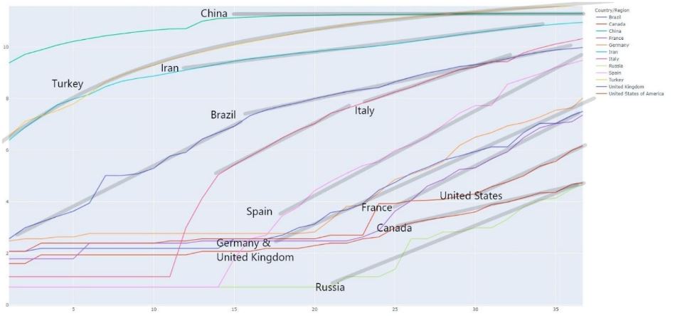
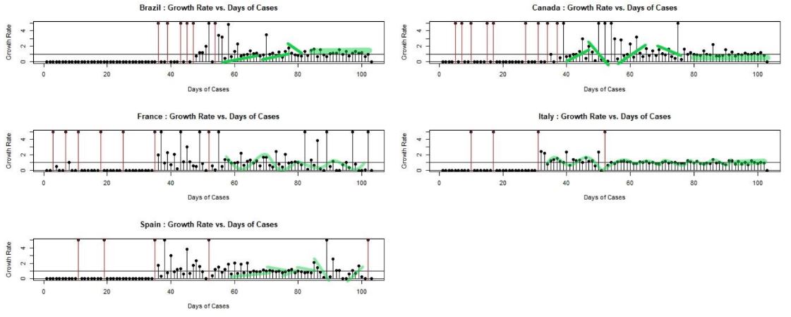
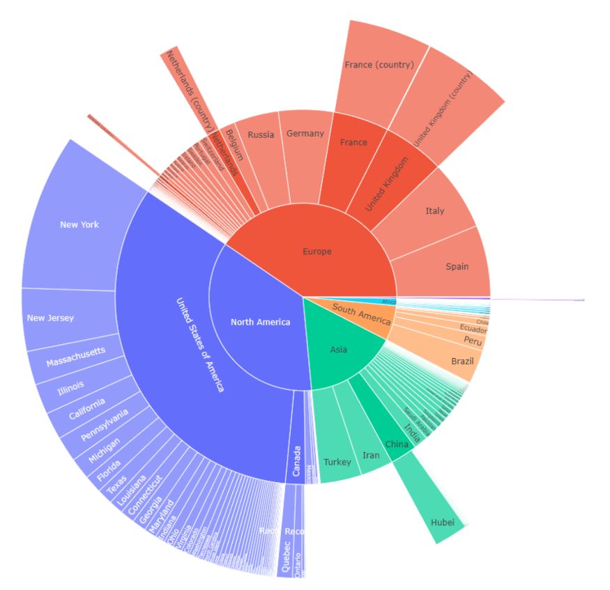
This is the final project for the Data Visualization course with Prof. Caban in Spring ‘20 at JHU. The goal of the project is to use data visualization methods to explore the COVID-19 dataset. In this project, six different visualizations were created to help understand the pandemic. The majority of the focus is on understanding the trend in the growth of the number of cases by analyzing the exponential growth across countries with at least 50,000 cases as of 5/11/20. The conclusion is that despite the pandemic causing havoc in much of the developed world, it appears that the growth in cases is manageable and that they will recover in time. The concern then is for the developing world where the pandemic reaches at a later date. In these countries there’s a significantly larger population in combination with a weaker health infrastructure. The takeaway then is that once the developed world recovers the goal should be to focus on helping countries in places such as South America and Africa where they are more vulnerable. The final grade for the project is 100%.